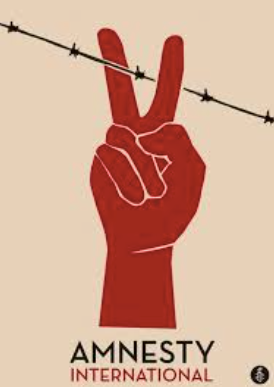
Unseen Advertisement- Amnesty International
Both the Shelter and Amnesty posters appeal to wanting a change in the world and illustrate this through their posters.
Amnesty are a charity organisation who work to help fight abuses of human rights worldwide. They work on various platforms such as armed conflicts, discrimination, freedom of expression, refugees and migrants, torture and international injustice. Their poster is used to appeal to the public that are not going through situations like this and are able to donate to the charity or to make people aware of the charity.
One obvious difference between the posters is that the Amnesty poster is constructed on a computer graphically whereas Shelter uses actors in the main structure then places text on top. The usage of the graphic design allows Amnesty International to construct the poster to their preferences and really highlight their ideologies.
The poster uses a beige background contrasting with the red and black. This use of colour beige is representative of dependance, conserving, and flexibility. The color beige is neutral, calm, and relaxing which completely juxtaposes with the colour red which typically symbolises danger, bloodshed and anger. This contrast may link with the ideas of the charity as the main colour is the neutral and calm beige which we could infer means that overall the charity wants to achieve peace and neutrality. The hand however is the main image and is constructed into a peace sign which could represent obviously the peace that the charity wants to achieve but also is representing the anger and outrage the charity may feel towards the abuse of human rights across the world.
The hand is an essential part of this poster as it dominates the frame. As well as the peace sign it is also used to represent scissors cutting the oppressive, restrictive and controlling barbed wire which represents a barrier between human rights. The use of the barbed wire may also convey a war-torn area.


Comments
Post a Comment