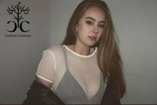
Cotton Couture billboard posters

Evaluation
My final posters convey the fair trade ethos and fashion genre by using the media language and advertisement conventions. In each of my posters I have attempted to create a symbiotic relationship between organic, fair trade cotton and a fashionable style. On the posters I have used both male and female models. This shows the diversity in the brand, letting the audience know that the brand creates clothing aimed at both male and female genders, which therefore creates a larger audience demographic. Each of my models show different stances which shows off different angles of the clothing. I have used different clothing in each picture to show the range of products available.
To establish continuity I primarily used the logo which I believe effectively shows both the fair trade and fashion side of the brand. The logo uses a plain colour (either black on white depending on the background of the poster) for clarity. In the logo I used two C's mirrored (similar to the Chanel logo however mine do not overlap) with a tree in the centre which conveys growth. I chose this logo as I thought it conveyed the fair trade ethos well. The name of the brand is also featured under the logo which has been done to show the brand name however if the brand became more popular the name could be removed and only show the logo as the audience would relate the logo to the brand.
In my first poster I used a female model in a relaxed stance with a medium close up shot. The media language has been used here to portray both the fair trade ethos and the fashion genre however I believe that the fair trade element could have been presented more clearly in this particular poster. The model is wearing a mesh white top which conveys the colour of the cotton and purity of the brand. Underneath this a black bralette is featured and a denim jacket worn loosely around the shoulders. This particular ensemble of clothing appeals to the fashion genre as it is portraying an edgy and party-wear line of clothing. I have chosen to edit the photo with a darkening effect so that it blends into my second poster more and features similar colours. The background is a plain grey colour which primarily draws attention to the clothing as there is no distractions elsewhere. The lighting used on this photo was created by the camera flash which I chose to do in order to avoid getting shadows in the background. On this poster the logo is featured in the top left corner in black. One critique I have about this particular poster is I believe the logo could be made the same size as the logo in the second poster.
When re-drafting this poster I changed the logo size and edited the posters background so that it would blend in better with the second poster.
The second poster features a male model also and also uses a medium close up shot. Here I believe the most noticeable element is the shadow casted upon the background which I believe creates a uniqueness to the poster. This shadow creates a darker grey tone on the right and lighter grey with an orange hue tone on the left. The background links to the fair trade element as it features a plant or floral style which blends with the logo and theme of growth. Similar to the first poster the model uses a relaxed stance to portray comfort in the clothing. This poster shows the male line of clothing. The jumper on the model also conveys different seasonal lines as in the first poster the outfit is more summer/spring based however this outfit is more autumn/winter.
I also chose to darken this image to make it blend with the first poster and establish continuity. I believe that these two posters link well together and it is clear to see they are the same brand.
Although I believe that this poster works well, I would probably include more of the clothing itself in the poster next time as opposed to just the top half.
My final poster uses the same female model as the first poster and also uses the same medium close up shot however this poster features more of the clothing. This poster is quite different compared to the other two as the image has been taken outside,the poster uses a portrait orientation and the editing is angelic like and more noticeable. I chose to feature this poster as the brief specified for an A4 poster presumably portrait orientation yet my other two posters were taken with a landscape orientation so I featured this one in order to adhere to the brief.
This poster uses the natural lighting as it is taken outside. This adds to the fair trade ethos as the natural setting connotes the natural element of the product. I have blurred the background of this image in order to have focus on the model rather than the background. This has created an angelic persona to the model and enhances the fashion genre focus. The clothing used on the model is primarily cotton based so works well with the branding. I chose to have the model looking to the side as opposed to directly at the camera in order to keep the focus on the clothing.
 My final posters differ from my original plans slightly as I chose to have the models in different stances and have a landscape orientation on the main posters. My second poster links to my original plan as I still used a male model with a jumper type outfit as shown in the drawing to the right, however I used a different position as in the actual poster the models head faces right rather than to the left. I chose to go against my original plans when I was taking the photo as the lighting worked better on the face when the model faced the right hand side.
 The female poster differs quite greatly compared to my original plans. I believe that I still managed to create a similar relaxed and comfortable stance through the model however I did not feature hands close to the face nor did I use a jumper type clothing which is portrayed in the drawing. I instead used more summer based clothes to show the different seasonal lines that my brand catered for.
During my production process I took many different photos (as shown on my photo contact sheet) using my own Nikon camera with a 18-105mm lens. As I had previously done GCSE media I had some photography and photoshop skills however I developed them more through tutorials online during the process of making my posters. I knew basic things on photoshop such as enlarging, cropping, selecting etc. however I had not done them in some time so it was refreshing to see what I could remember.
In conclusion I believe that my posters are effective in showing a blend of fair trade ethos and fashion genre and adhere mostly to the brief. I would change the orientation of my posters to fit the brief better and show more of the clothing in my images.


WWW- The layout is good, clear pictures which show off fair trade aspect
ReplyDeleteEBI- You could show off more of the clothes
WWW: The pictures are clear and the logo has a perfect placement as it makes the image look high quality and professional.
ReplyDeleteEBI: A full body shot could be used to show a whole range of clothing as well as making the models have eye contact with the audience.
- Excellent use of 'cotton couture' and the symbol of a tree which clearly establishes the idea of a natural product.
ReplyDelete- The lighting is effective on poster 1 but the jumper appears slightly lost in the second.
- Try to include as much product as you can as models are missing their other halves. Fashion is the focus.
- The slogans you have attached to your posters appear in different places and it would have been nice if the posters more closely resembled each other.
- I'm not sure I like the editing effect of the last one as the blurring of the hair distracts from the clothes and appears more angelic rather than the realistic impressions of the first two.
- An excellent attempt and quality photographs. Try to promote more of the clothes.